The visual and conceptual elements that identify Seers
Our logo is an abstract representation of an eagle in flight; with emphasis on the eyes and wings to highlight (i) the strong vision of the Organisation, and (ii) the inherent strength and agility that ensures the accomplishment of the vision respectively. This abstraction comes out as a ‘check’ mark or ‘correct’ sign / symbol to represent the ‘correctness’ (i.e. appropriateness) or the great potency of the solutions we offer to achieve the founding objectives.
The blue colour represents how high we aim; towards the skies and beyond, mindful that the sky is not the limit! The black body represents humanity in general.
Advertisement
Featured
Specially selected items from our online shop
View basket “Zing4Life! Part 7 :: True Leader – Direct Coaching*” has been added to your basket.
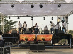
With pleasure, we take the opportunity to invite you to join the upcoming edition of Time with Seers special weekly online seminars; you may click here for details. For our full calendar of events you may click here.
You can pay in any valid currency of your choice. Also, several payment options are available; including Mobile Money, Bank Card, Etc.
To select (or reserve) an item you are interested in, just click the ‘Add to Basket‘ button beneath that particular item; please do this for each of the items you seek to add to your selection. And ‘View Your Selection / Basket‘ later, and then proceed to checkout.
For additional terms regarding ‘Direct Coaching‘ please scroll further down this Quick Guide. If you are new to buying online (online shopping) and need some additional (in-depth) guidance you may click the button below…
Comes in 2 main options, each with a different cost implication...
Option 1 :: Online on a suitable interactive social media platform with the guidance of a facilitator
Option 2 :: In person with a facilitator at a training location / venue (usually our premises, or an equally suitable location for the training)*
Prices shown for Direct Coaching* are for the popular choice... Option 1. This includes Bronze Membership, allowing you online access to special content to complement the Direct Coaching.
For Option 2, a minimum of 10 subscription purchases are required. Where trainee(s) opt for a significantly different training location / venue other than one within the reach of the facilitator, prorated facilitator transportation charges (FTC) may apply, in addition to the subscription purchases. Where it occurs, actual figures shall be determined and agreed upon prior to the training.
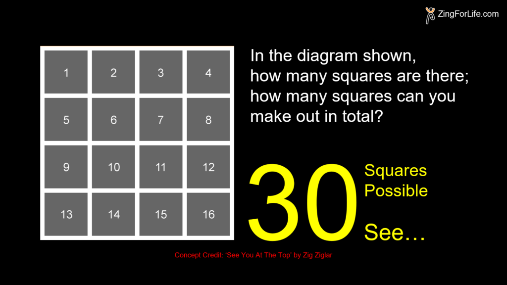
So in the diagram, how many squares did you make out in total; how many squares are there?
Well, most people get or give 16 as their answer. Some get 17 and a few get 21; and that’s at least better than the ‘16’ answer majority of people give. Just about 1 percent of people surveyed get the best answer; which is…
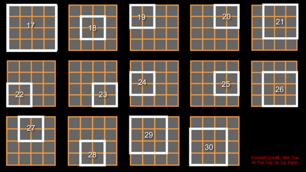
Well, get a full illustration of all the more than 21 possible ‘hidden’ squares…
Lessons…
One: Sometimes you need someone to show you the obvious, and oftentimes… the not so obvious! Credit to ZigZiglar
Two: Education and schooling are not the same thing. What goes on inside the schools is often not education. And the results may well be that it reduces productive capacity rather than to increase it. Credit to Prof Sir William Arthur Lewis
Three: My people are destroyed for lack of knowledge. Credit to Prophet Hosea
Four: The illiterates of the future are not those who cannot read or write, but those who cannot learn, unlearn, and relearn! Credit to Alvin Toffler
Five: The greatest obstacle to progress is not ignorance, but the illusion of knowledge. Credit to Daniel Boorstin
Six: When you know the right things, the boundaries around your life suddenly disappear. Credit to Brian Sher